You can customize your data appearance on the Add/Edit/Search pages using formatting options in the "Edit as" settings dialog. You can define the field settings for all pages at once or separately for each page.
To control the field appearance on the page, click on the field and then on the View As/Edit as button in the properties.
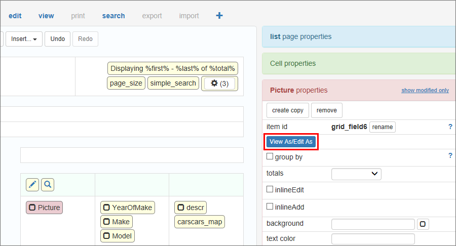
To set different field formats for different pages enable the Use different settings for all pages checkbox.
Depending on the selected format, you will see different dialogs.
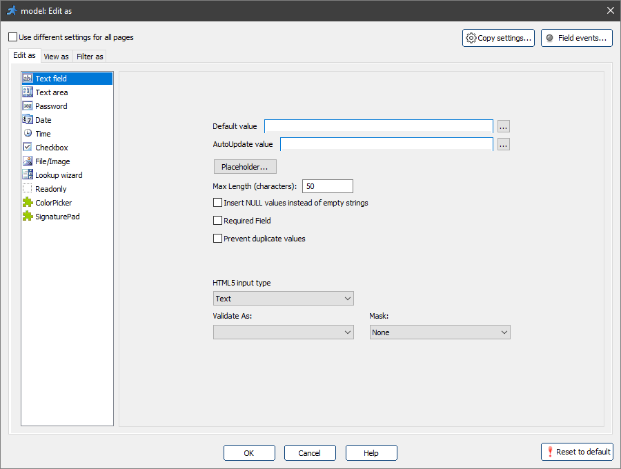
Common options for "Edit as" formats
Default value
Default value will be assigned to a field directly on the Add/Search pages. Default value should be a valid C#/VB.NET expression.
Text expressions must be quoted.
Example of the default value |
Description |
35 |
Number. |
"ABC" |
Text. |
Now() |
Current date/time. |
DateTime.Now |
Username of the person who created or updated the record. |
MVCFunctions.GetServerVariable("remote_addr") |
IP address of the user. |
Note: the Default value option appears only when you have not selected the Use different settings for all pages checkbox.
Validate as
For more information about validation, see Validation types.
AutoUpdate value
An AutoUpdate value will be assigned to a field every time a record is updated on the Edit page. You can use this feature to keep track of who and when updated the record.
An AutoUpdate value should be a valid C#/VB.NET expression. See sample expressions for the Default value.
Placeholder
Placeholders are the tooltips within the field that disappear as soon as the user starts typing something in that field.
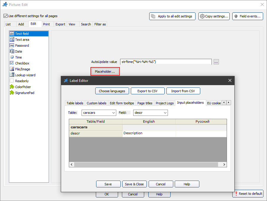
The placeholder looks like this on the generated page:

You can also change the placeholders in the Label Editor or using the Labels/Titles API.
Feel free to check the following live demo that showcases placeholders.
Prevent duplicate values
Use this option to prevent users from entering duplicate values. Enter a message that will be displayed when users enter a value that already exists in the database.
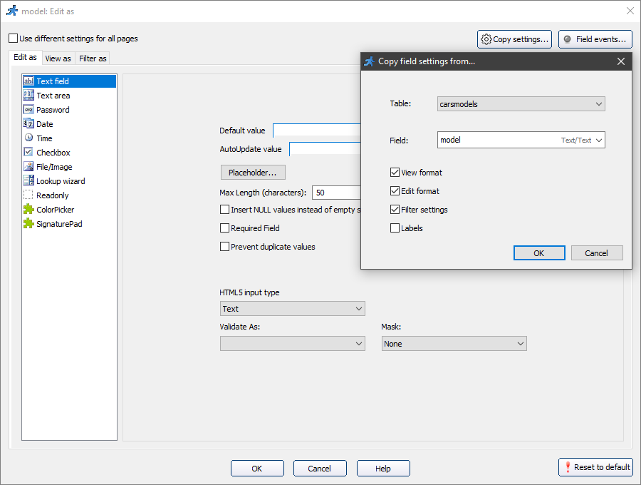
Copy settings
Copy settings option allows you to copy the settings from another field.
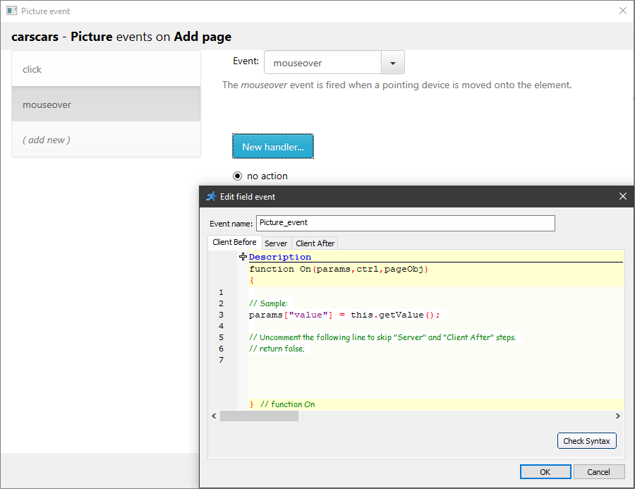
Field events
The Field events option allows performing an action when the cursor enters, leaves or is over an edit field. Perform any sort of validation, make other fields hidden or required, etc. Field events are designed to work on Add, Edit, View and Register pages.
For example, the mouseover event occurs when the pointer is over the selected element.
A simple text box. For more information, see "Edit as" settings: Text field.
A multiline text area. For more information, see "Edit as" settings: Text area.
A password field. All entered characters appear as "*".
Note: if you want the empty password field to insert NULL into the table, select the Insert NULL values instead of empty strings checkbox.
This option may come as useful for indicating that no data is available for the field.
A date edit control. For more information, see "Edit as" settings: Date.
A time edit control. For more information, see "Edit as" settings: Time.
A checkbox control. Works best with the following data types:
•MS Access: Yes/No field;
•SQL Server: TINYINT or BIT field;
•MySQL: TINYINT field;
•Oracle: NUMBER(1) field.
Select the Required field option to make the checkbox required.
That way it should be selected before submitting a form.
Use this option for the fields such as the Accept License Agreement and Terms.
Choose this format if you store files/images in this field. For more information, see "Edit as" settings: File/Image.
A drop-down box with a list of values. For more information, see "Edit as" settings: Lookup wizard.
Use this format for a field that should not be edited.
The ColorPicker control allows users to select the color the same way they do in Adobe Photoshop. For more information, see "Edit as" settings: ColorPicker.
The SignaturePad control allows you to add a signature pad to your forms. For more information, see "Edit as" settings: SignaturePad.
See also:
•How to access fields in the field events
•How to create a custom Edit control plugin